Project Pitches Training Camp Commences! Color Grading Mentor Qiu Siyi: Simplicity and Harmony are a High Level of Visual Aesthetics
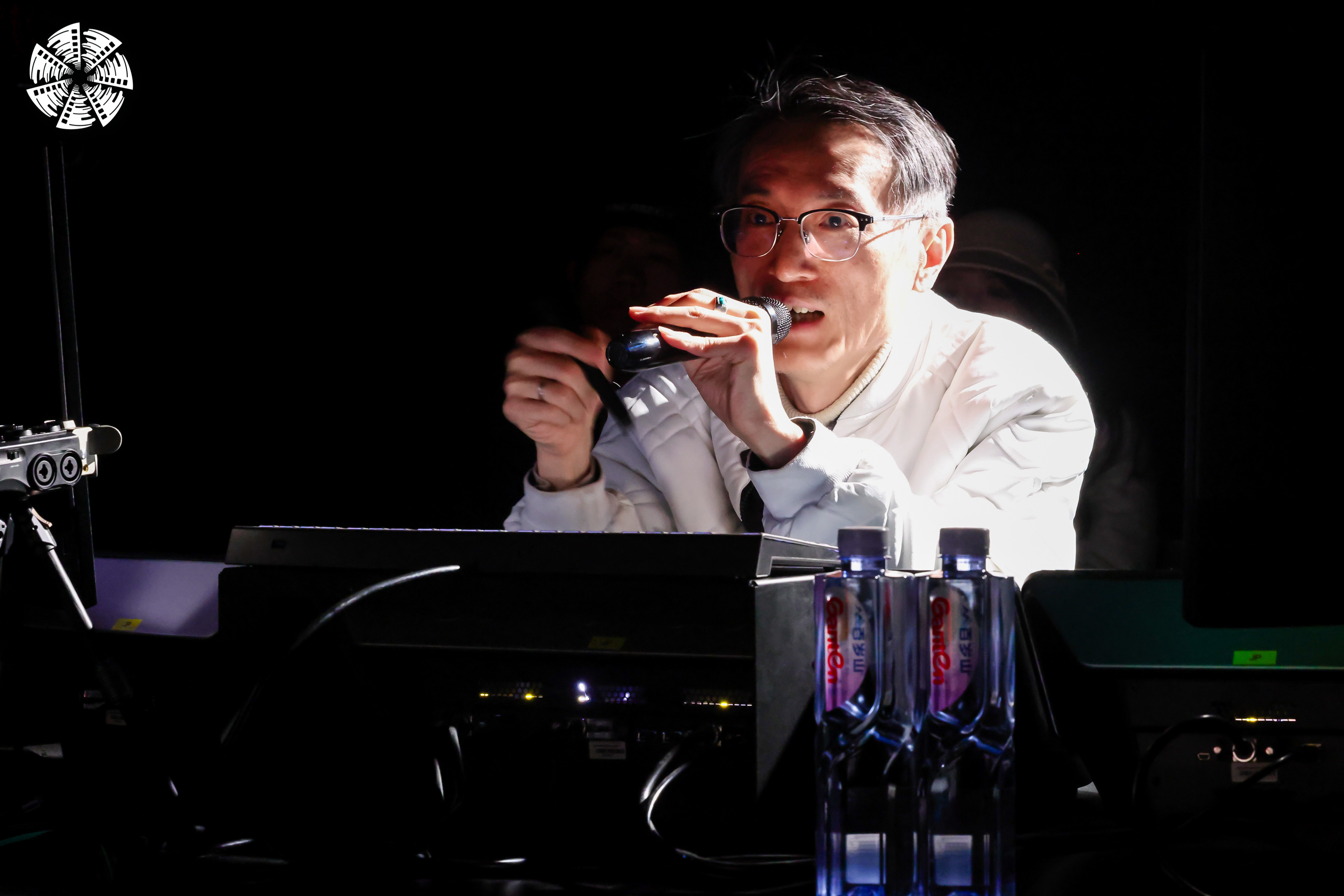
On January 24, the Project Pitches Training Camp at the 16th Beijing International Film Festival (BJIFF) hosted a class on color grading, led by Mentor Qu Siyi, a senior colorist supervisor from Taiwan, China. Mentor Qu Siyi has contributed to the color grading of numerous acclaimed Chinese-language films, including Detective Chinatown 1900, Decoded, Shadow, The Flowers of War, Under the Hawthorn Tree, and Secret. He describes colorists as "the final gatekeepers of a film", stressing the need for a sharp aesthetic sense, intuition, and strong communication skills. Ultimately, he argues, all color decisions should serve the film's narrative rather than imposing a rigid personal style.
Mentor Qu Siyi entered the industry in 1987, beginning with color grading for music videos. Throughout his career, he has worked on over 3,000 projects, including iconic works from artists like Zhang Yusheng and The Little Tigers. Since 2000, he has transitioned fully into film, serving as both a witness to and a catalyst for the shift from film to digital eras. Beyond his hands-on work, Mentor Qu Siyi has founded studios, introduced international resources, and committed to mentoring emerging filmmakers by sharing his systematic professional insights and cutting-edge techniques.
In this Project Pitches Training Camp class, Mentor Qiu Siyi used carefully selected video clips to demonstrate the core differences between film and digital media in texture, color, and workflow, delivering decades of expertise in an engaging and accessible way. Drawing on his extensive practical experience and structured approach, he revealed key elements of cinematic visual creation, inspiring trainees from conceptual foundations to technical proficiency.
Film vs. Digital: Not Replacement, But a Question of Superior Perception
Despite the rapid rise of digital cinematography today, film remains relevant and irreplaceable. Mentor Qu Siyi emphasized film's unique strengths in color continuity and tonal transitions, rooted in its analog nature. Film records images through photochemical reactions, unbound by the fixed boundaries of digital color spaces.
Digital cameras, limited by sensor technology and color science, are improving in dynamic range. However, their imaging relies on mapping within predefined parameters like color spaces and gamma curves. This can sometimes result in color banding or unnatural transitions in extreme tonal regions, particularly in shadow areas. Film, by contrast, captures light through the distribution of silver halide grains. When paired with modern high-resolution scanning technology, it retains richer and smoother tonal information, delivering a distinct visual texture. As the dynamic range, color sampling, and quantization accuracy of sensors continue to improve, alongside advancements in image processing algorithms and color science, the technical limitations of digital cameras in color and tonal transitions are being systematically addressed.
The Heart of a Cinematic Look: Tonal Gradation Over Simple Contrast
A common misunderstanding equates a "cinematic" or "film-like" quality with high contrast alone. True visual depth arises from seamless transitions from highlights to shadows and subtle color variations. Harsh digital transitions often stem from missing or disjointed midtones, not low contrast. Thus, in shooting and post-production, the focus should be on building and maintaining image hierarchy, rather than blanket contrast boosts. For film footage, which naturally retains tonal continuity, aggressive LUTs or overzealous adjustments can erode its inherent delicacy.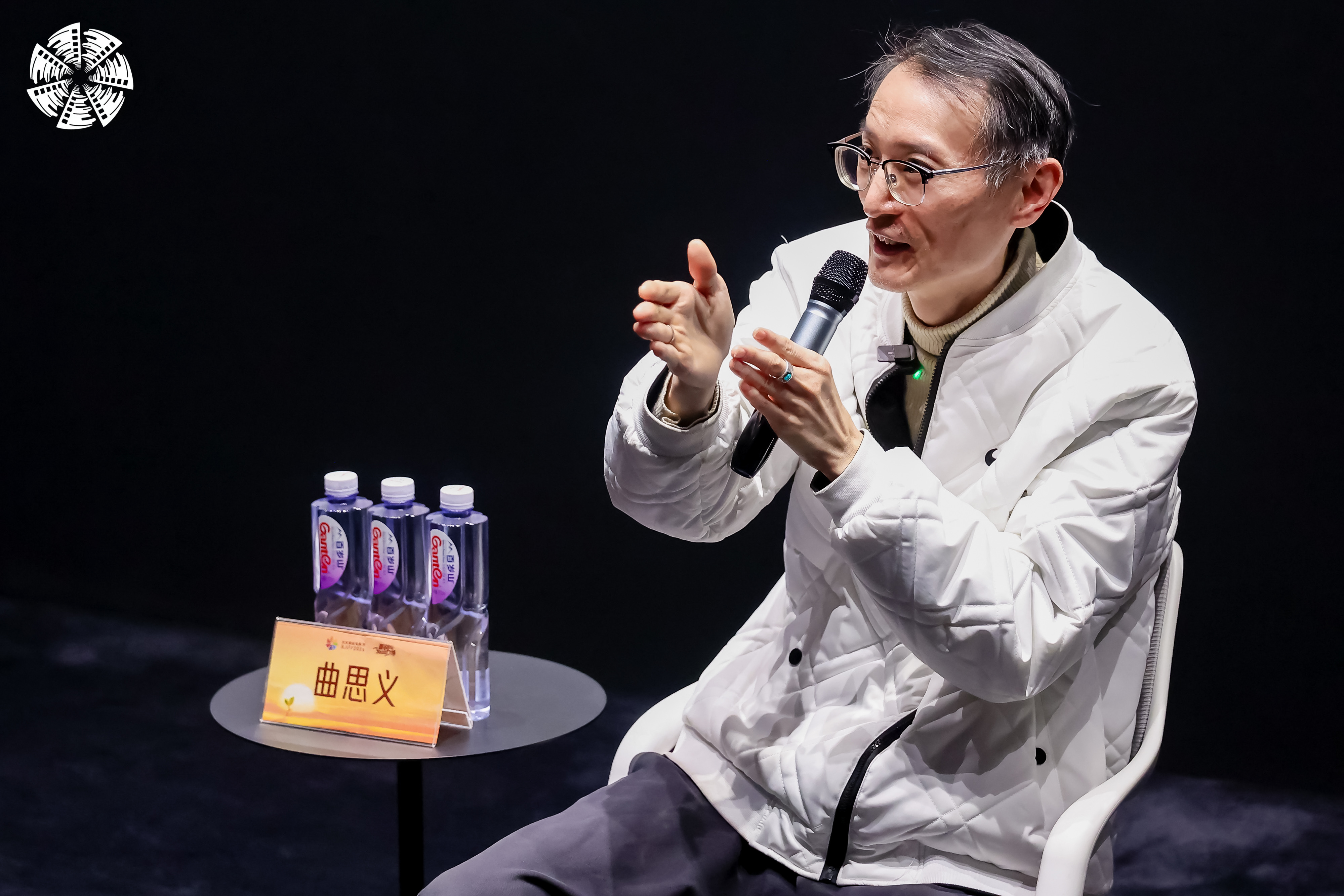
Questions raised during the lecture were promptly addressed, while the post-class discussion session sparked more in-depth conversations. Here are some highlights from the discussion:
Q1: Does film have a specific color space?
Qu Siyi: Film captures light and shadow directly via chemical reactions in silver halide grains, with final colors influenced by development and projection medium. Its original data is theoretically infinite, revealing more details with higher scanning resolutions (e.g., 10K or 16K). Color space is a post-production construct for standardized reproduction, not mirroring human perception. Thus, in the film era, no digital color space constraints existed.
Moreover, color space limits aren't about the recording medium - film or digital - but the capabilities of display and projection technology nowadays. Regardless of whether film or digital is used for shooting, how much can ultimately be presented to the audience depends on the range of colors that end devices such as projectors and screens can reproduce.
Q2: Do you believe that film style is equivalent to "high contrast"?
Qu Siyi: This is a habitual perception based on certain historical projection conditions. Drawing from my extensive experience in color grading for TV commercials, the visual characteristics of film should not be simply summarized as "high contrast". In my view, film itself can present rich color gradations and subtle tonal contrast relationships. Today, associating "old film style" with high contrast is actually a misunderstanding. To me, "film style" is an expressive form of imagery that naturally conveys scene colors and contrasts while maintaining delicate layers and texture.
Q3: How were color grading standards set in the film era?
Qu Siyi: The establishment of standards heavily relies on human experience. Having collaborated closely with color timers for many years, I've seen firsthand how their decisions stemmed from intuition honed over decades. For example, if a projection revealed a noticeable lack of green, the timer would apply a corrective filter, then reprint a test strip to compare the results. This was an iterative process of trial and error, with no absolute numerical standards. On set, without real-time monitoring, cinematographers depended on technical parameters combined with their own predictive judgment to capture the intended look.
Q4: In the digital era, how should color cast issues in film be addressed?
Qu Siyi: Some color cast issues can be resolved during pre-production by using corrective filters, which preserves maximum creative flexibility in post. For instance, when shooting tungsten-balanced film in daylight, an 85 filter can neutralize the color cast and maintain accurate color temperature. In post-production, 35mm film's wide dynamic range provides substantial latitude for correction on the grading suite, so minor casts can often be addressed without compromising the image. This flexibility means that some casts can be temporarily tolerated on set. However, with narrower-latitude formats like 16mm or Super 8, it's generally wiser to prioritize manual color correction in post.
Q5: What is the general workflow for black-and-white films? Which step is the most challenging?
Qu Siyi: Converting color footage to black-and-white goes far beyond simple desaturation. The process involves selectively adjusting the individual RGB channels in a digital grading system. For example, lifting the red channel can soften skin tones and create a more flattering look, while crushing the blue channel deepens skies for added drama. This technique exploits the luminance differences in the original colors to build rich, nuanced tonal separation - rather than just controlling overall brightness. To recreate the authentic texture of classic black-and-white film, additional stylized treatments are often applied: introducing controlled film grain for tactile realism, subtly emulating lens characteristics to evoke a specific period, and gently compressing shadows while lifting their overall density to achieve soft, layered tonal gradations. Together, these steps bring digital black-and-white images as close as possible to the visual character of traditional silver-halide release prints - deep, organic tonal depth and the distinctive aesthetic of film grain.

Q6: If I want to achieve the aesthetic of black-and-white ink wash paintings, how should I communicate this with the colorist?
Qu Siyi: A strong reference is the approach used in Shadow, directed by Zhang Yimou. The director specifically wanted to "evoke the spirit of traditional Chinese ink wash painting", asking to retain faint traces of skin tones and green within an otherwise monochromatic palette. My solution was to first reduce overall saturation to around 10%, then convert to black-and-white using blend modes. From there, I selectively reintroduced color information through targeted isolation techniques, carefully controlling the presence of skin tones and green within the grayscale structure. The result maintained an overall black-and-white character while avoiding harsh contrast; instead, it captured the gentle light, soft transitions, and layered subtlety that define the mood and artistic conception of ink wash painting.
Q7: Some films look good in the initial stages, but why do they end up looking cheap after color grading?
Qu Siyi: A common issue today is the overuse of strong, uniform color casts - often bluish-green or heavy yellow-orange - that can strip away depth and make images feel flat. I personally prefer to grade from scratch without heavy reliance on LUTs. In fact, a LUT is essentially a preset framework of a color space that simultaneously locks in the color and tonal relationships of an image's highlights, midtones, and shadows. However, LUTs are generated under ideal laboratory conditions and are difficult to perfectly match with real-world shooting scenarios. Applying them directly is equivalent to imposing a dynamic range and color boundary on the image. If the exposure and color temperature of the shot footage differ from the conditions assumed by the LUT, forcing its application will only result in a loss of image detail and gradation.
Q8: Not using LUTs can preserve more color space, but some colorists might not know where to start. Do you have any advice?
Qu Siyi: In the early stages, colorists may not be proficient in constructing the contrast and color relationships within an image, while LUTs can provide a clear stylistic framework. A practical approach is to select an appropriate LUT as a reference, apply it temporarily to guide the overall look, then manually rebuild and refine the image to match that tonal and contrast foundation. This method helps overcome the initial uncertainty of where to begin while still leaving plenty of room for creative adjustments later in the process.
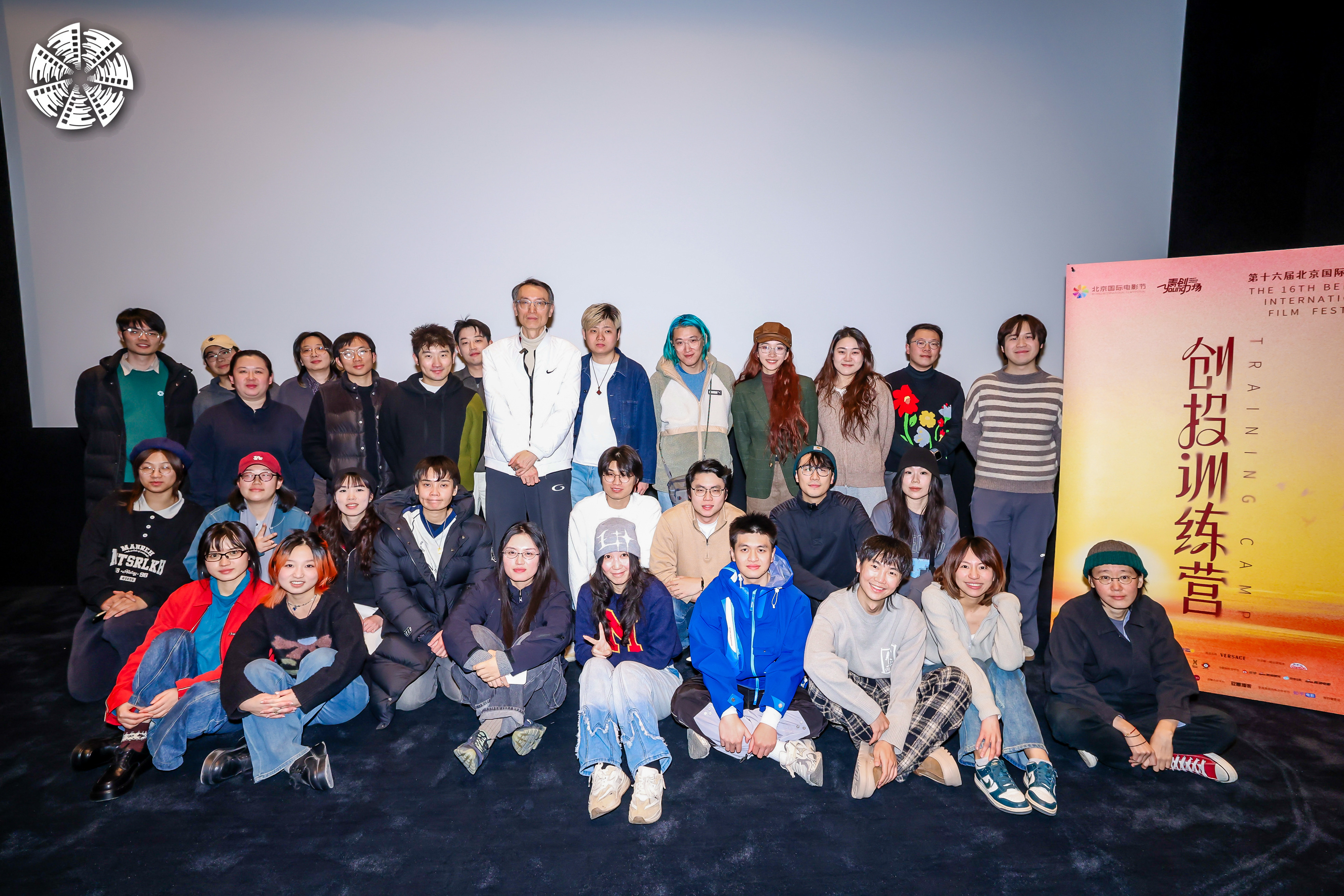
The narrative of light and shadow never stops. Mentor Qu Siyi's class not only unveiled the mysteries of color for the trainees of the Project Pitches Training Camp, but also allowed all of us to witness the meticulous craftsmanship behind the birth of a film. As the Project Pitches Training Camp classes draw to a close, all trainees have completed their team formations on January 25. We look forward to seeing each trainee gain valuable insights and prepare thoroughly for the upcoming Greenlight Session.